Thematic Map AP Human Geography: Types and Examples
Learn thematic map AP Human Geography types—choropleth, dot density, proportional symbol, isoline, cartograms—with clear examples and FRQ-ready tips.

You're staring at a Unit 1 map of world GDP, expecting something like the political outline map you colored in middle school. Instead, the countries are shaded in different colors, some shapes are distorted, and the legend seems to be making half the argument for you. At 11 p.m., that can feel less like geography and more like a visual ambush.
The key is to stop treating a map as a picture and start treating it as a question. A thematic map in AP Human Geography shows a particular human or physical variable across space. Your job is to identify what the symbols represent, notice the spatial pattern, and explain why that pattern exists.
Table of Contents
- Why Thematic Maps Matter in AP Human Geography
- The Five Core Thematic Map Types
- How Classification Changes What a Choropleth Shows
- Reading Thematic Maps in FRQ and MCQ Scenarios
- Misleading Maps and How to Avoid Them
- A One-Week Study Plan for the AP Exam
Why Thematic Maps Matter in AP Human Geography
A reference map helps you locate things. It may show political borders, roads, cities, rivers, or landforms. A thematic map focuses attention on one topic, such as population density, literacy, language, migration, or economic activity. A reference map answers, “Where is it?” A thematic map asks, “Where is this variable concentrated, and what might explain that distribution?”
Suppose you see a plain political map of Africa. You can use it to identify countries and borders, but it won't tell you much about differences in literacy. A choropleth map of literacy rates uses shades within country boundaries to compare a single measure across areas. The borders still provide location, but the colors carry the main information.

Thematic maps appear throughout AP Human Geography. You may use them to discuss population distribution, cultural patterns, political behavior, agriculture, development, migration, or urban land use. The same basic reading habit works in each unit:
- Read the title and legend.
- Identify the variable and its measurement.
- Describe the visible pattern.
- Explain the pattern with a geographic concept.
The core map types include choropleth maps, dot density maps, proportional symbol maps, isoline maps, and cartograms. Each one uses a different visual language, so choosing the wrong type can lead you toward the wrong conclusion.
Practical rule: Before explaining a map, ask whether the data show a count, a rate, a rank, a concentration, or a gradual surface.
The College Board likes thematic maps because they test reasoning rather than simple memorization. You might know where a region is, but the higher-scoring answer explains why the pattern appears there and how the map's design affects what you can infer. If you're also trying to organize notes and review efficiently, this guide to studying smarter can help you build that habit around your own class materials.
The Five Core Thematic Map Types
Think of the five map types as different answers to different data problems. The correct choice depends less on the map's appearance than on what the variable represents.
Choropleth maps
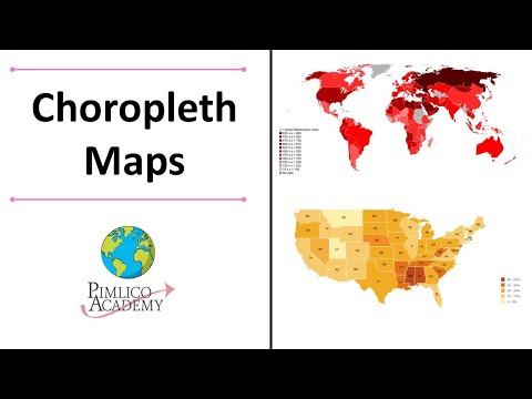
A choropleth map shades predefined areas, such as countries, states, or counties. It works best for rates, percentages, ratios, and densities, especially when comparing one area with another. An AP-style prompt might show HDI across African countries and ask which pattern is most evident.
The visual strength is comparison among areas. The hidden problem is that the color usually summarizes the entire polygon. A large country may contain major internal differences that disappear under one shade. If the map uses a raw count rather than a normalized measure, larger areas can also appear more important because they cover more space.
Trigger question: “Which region has the highest level of development, and what geographic factors may explain the pattern?”
Dot density maps
A dot density map uses repeated dots to represent a count or concentration. A prompt might show rural population distribution across the U.S. Midwest, with each dot standing for a quantity described in the legend.
Dots can reveal clusters more clearly than area shading. They can also create confusion if students treat every dot as a precise location. A dot may represent an assigned amount within an area, not the exact household or settlement where that population lives.
Trigger question: “Which area shows the greatest concentration of rural population?”
Proportional symbol maps
A proportional symbol map places symbols at locations, with symbol size changing according to the value. A map of earthquake magnitudes or city populations might use increasingly large circles.
This format preserves the idea that the data belong to particular points or places. The largest symbol often attracts attention, though, and students may overstate its importance without checking the scale or comparing neighboring symbols.
Trigger question: “Which location has the greatest magnitude, and how does its size compare with nearby locations?”
Isoline maps
An isoline map connects places with equal values. Contour lines show elevation, while other isolines can represent temperature, pressure, or precipitation.
This type is useful for a variable that changes gradually across space. The tradeoff is smoothing. The lines suggest continuity between measured locations, so sharp local transitions may not appear clearly.
Trigger question: “In which direction does the measured variable increase, and what physical or human process might produce that gradient?”
Cartograms
A cartogram changes the size or shape of geographic areas to represent a variable such as population or GDP. A country with a large value may appear enlarged, while a country with a smaller value may shrink.
The distortion is the point, not an error. Still, students can mistake visual area for actual land area or struggle to identify familiar places after their shapes change.
Trigger question: “Which places carry the greatest relative magnitude, and how does that differ from their actual geographic area?”
The exam often gives you a description and a graphic, then asks which map would best display the data. That's a symbol-choice question. Match the map to the measurement before you start interpreting the pattern.

How Classification Changes What a Choropleth Shows
A choropleth's colors don't speak for themselves. The classification method determines which places receive each color, so the legend shapes the answer you write.
Use one imaginary dataset, such as the percentage of people with internet access across U.S. states. The values stay the same, but the map can classify them in different ways.
- Quantiles place an equal number of states in each class. This emphasizes rank. It can make the map look evenly distributed even when the values themselves are uneven.
- Equal intervals divide the numerical range into equal-width bands. This preserves absolute spacing and can make the distance between low and high values visually prominent.
- Natural breaks place class boundaries where the data form clusters. Jenks or Fisher-Jenks methods minimize within-class variation, which can reveal groupings in a skewed dataset.
| Classification Method | How It Cuts the Data | What It Emphasizes | FRQ Risk |
|---|---|---|---|
| Quantiles | Equal counts per class | Rank and relative position | You may claim an even distribution because each color has similar representation |
| Equal intervals | Equal numerical spacing | Absolute differences | You may overlook clusters in the middle |
| Natural breaks | Data-dependent clusters | Separation between groups | You may compare maps across years using changing breaks |
Imagine writing “internet access is evenly distributed” after seeing similar numbers of states in each color. That might describe a quantile map, not the underlying data. A natural-breaks map could instead make a high-value cluster stand out while placing most middle-value states together.
For an FRQ asking you to describe the spatial pattern, start with the legend, then write what the map shows:
States with the highest values are concentrated in the ___ region, while the lowest values cluster in ___.
That sentence describes location and pattern without pretending that the colors prove causation. For the explanation point, connect the observed pattern to a relevant concept, such as infrastructure, development, urbanization, or uneven access.
The legend is part of the argument. If you ignore the classification method, you may describe the map's visual design instead of the geographic pattern.
Reading Thematic Maps in FRQ and MCQ Scenarios
The wording of the question gives you a useful cue. “Best described as” usually asks you to identify a pattern or map type. “Most likely” asks you to connect the pattern to a geographic process. “Describe and explain” requires two separate moves, observation first and reasoning second.
Scenario one, population density and dots
An MCQ shows dots clustered around a few regions and asks which statement best describes the distribution. Read the dot key before counting anything. If the dots represent population, look for clusters, gaps, and corridors, not darker colors or larger political areas.
A strong internal translation is: “The dots are concentrated in these places, so the population is clustered rather than evenly dispersed.” If the options mention density, check whether the map shows people per unit of area or a count represented by dots. Those aren't interchangeable.
Scenario two, HDI and choropleth shading
An FRQ gives you a choropleth of HDI across Africa and asks you to describe and explain the pattern. Begin with a regional statement that names both high and low areas, using only what the legend supports.
A useful response frame is:
- Describe: “Higher HDI values are concentrated in ___, while lower values are more common in ___.”
- Explain: “This pattern may reflect differences in access to education, health services, income, infrastructure, or historical investment.”
The first sentence earns description by locating the pattern. The second explains a possible relationship. Don't turn a map observation into an unsupported claim about every country or every resident.
Scenario three, GDP and a cartogram
A cartogram of the world may make high-GDP countries appear much larger than their physical size. If the question asks which economy has the greatest relative magnitude, use the distorted size and legend. If it asks about actual area, use a reference map or geographic knowledge instead.
Scale of analysis matters. A cartogram can communicate a global economic pattern effectively, but it isn't a reliable guide to physical distance, land area, or shape. Students who practice these distinctions with a map-focused quiz can use a quiz generator for studying to turn each map into short identification and explanation questions.
Answer in the order the prompt asks: identify the evidence, describe the spatial pattern, then explain the process.
Misleading Maps and How to Avoid Them
Maps can mislead without containing false data. The danger usually comes from a mismatch between the variable, the symbol, and the conclusion.
- Raw counts in a choropleth: A student sees a dark, large state and writes that it has the highest population density. Fix: Ask, “Is this a count, rate, or density?” Area shading works best for normalized measures.
- An unreadable legend: A student describes “dark” and “light” areas without knowing which means high. Fix: Read the title, units, and color order before naming a pattern.
- Area bias in a cartogram: A student assumes an enlarged country has more land. Fix: Separate visual size from physical area. The distortion represents the selected variable.
- Taking scale too literally: A student treats a country-level pattern as true for every city or neighborhood. Fix: Match the claim to the map's scale. A national average can hide internal variation.
A quick defensive routine works under exam pressure: title, legend, unit, symbol, pattern, explanation. If one of those pieces is missing, narrow your claim rather than guessing.
A One-Week Study Plan for the AP Exam
Use one map type and one AP skill each day. The point isn't to memorize definitions in isolation. It's to practice turning visual evidence into a precise geographic response.
- Day 1, choropleth: Reclassify one dataset mentally as quantiles, equal intervals, and natural breaks. Write one pattern statement for each.
- Day 2, dot density: Practice the difference between density and distribution. Describe where dots cluster and where they thin out.
- Day 3, proportional symbols: Compare symbol size, location, and magnitude. Check whether the map represents totals or rates.
- Day 4, isolines: Trace a gradient from low to high. Explain what a smooth transition may hide.
- Day 5, cartograms: Identify what controls size and what information distortion makes harder to read.
- Day 6, mixed maps: Complete a timed 10-minute FRQ using two thematic maps. Separate description from explanation.
- Day 7, full review: Complete another timed 10-minute FRQ, then review vocabulary, map types, classification methods, scale, density, distribution, and legend habits.

The night before the exam, rehearse one question: What does this symbol measure, and what does it leave out? A focused AP exam study guide can support the rest of your review, but the map-reading routine matters more than cramming another list of terms.
ClassLecture.ai can turn your geography lectures, notes, and textbook material into searchable transcripts, summaries, flashcards, and conversational practice. Upload your AP Human Geography materials and use questions about thematic maps, legends, classification, and FRQ reasoning to prepare with ClassLecture.ai.
The ClassLecture.ai Team
We build ClassLecture.ai, the AI study assistant that turns your recorded lectures into transcripts, summaries, flashcards, and answers cited to the exact timestamp — so you learn faster from your own professor's words.
Keep reading
English 101 and 102: Key Differences, Goals, and Tips
Compare English 101 and 102 to understand their goals, assignments, and how to study effectively for both courses.
ReadAP Art History Notes: 10 Resources for Better Study
Find AP Art History notes, flashcards, timelines, and study guides for the AP 250, plus ways to turn lectures and readings into better revision materials.
Read10 Check in Questions for Classes and Meetings
Discover 10 check in questions for classes and meetings, grouped by well-being, comprehension, and progress, with example phrasing and async tips.
Read